from http://money.cnn.com/2011/01/05/news/companies/starbucks_new_logo/index.htm
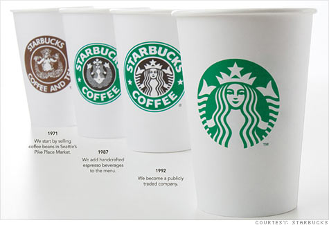
You can see how the logo has progressed from 1971 to today, starting out bland and detailed but informative in 1971, to bright and detailed in 1987, to a little less detailed in 1992 and now, completely missing the company name and using a simplified version of the old logo.
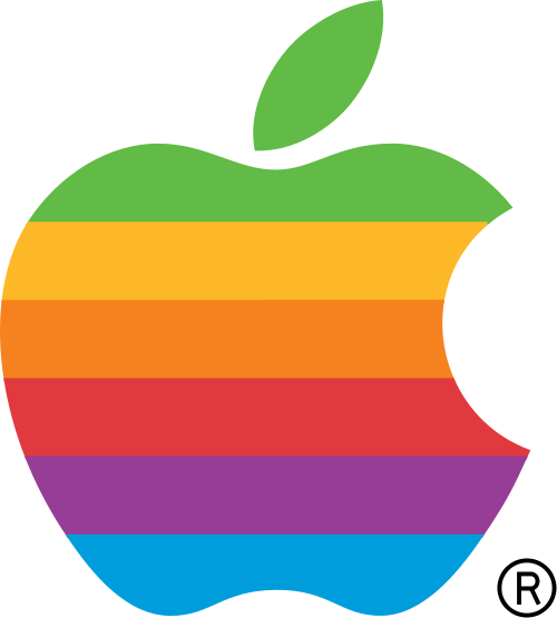
Now, in my opinion, the new logo is simple and elegant but removing the company name is confusing to me. Why would you create a logo without the company name? ...Especially since the logo Starbucks uses consists of a mermaid, which has absolutely nothing to do with coffee. Although there are other companies which have logos without the company name, but the logos make more sense. For instance Apple's logo which has progressed from:
 to
to  over the years.
Apple's logo makes complete and ironically literal sense, an apple represents the company brand name rather than representing that the company makes computers and other electronics.
Going back to Starbucks, I'm not the only one who is confused by the change in logos, the article sited above quotes Starbucks fans who are outraged by the change. So, why are some Starbucks fans angered by the change in logo while others think the change is "a beautiful and compelling way to move the company into the new millennium"? And why do some logos without the company name work for Apple, and not for others, perhaps like Starbucks? In Starbucks' case, is it because their new logo has nothing to do with coffee or for some other reason?
Why do some logos without the company name work for Apple, and not for others, perhaps like Starbucks? In Starbucks' case, is it because their new logo has nothing to do with coffee or for some other reason?
ReplyDeleteWell, very similar to what you previously stated, Apple's logo literally represents their companies name. So, when consumers see the logo they know the brand is Apple and are going to actually say the word even if they have never actually heard of the companies name. When consumers of Starbucks see a person carrying the coffee cup on the side of the road, they will no longer be able to read the name "Starbucks Coffee." This is a huge disadvantage in my eyes. Although the Starbucks logo is fairly well known in a lot of places, it is definitely not something that everyone knows. For a company that is looking to expand even greater than they have already, you would think that they would want to have more consumers reading their companies name instead of less.
The fact that Starbucks logo is a mermaid is also a huge set back. There are various companies that advertise their products with logo's that are not relative to the product and air commercials that also hold no relevance. It can work for some companies but not for others. One example is Geico. Geico, the insurance company, is notorious for airing commercials that have nothing to do with insurance. Although one of their "mascots" is the gecko, they have commercials featuring pigs and people dancing, etc. These all have nothing to do with insurance but it has been successful for Geico so they keep doing it.
With Starbucks they really should have reconsidered their marketing technique. When Starbucks first came out people would say, "I am going to go to Starbucks." Now, it is common for people to say, "I'm going to get a Starbucks." This is one way in which Starbucks has become a powerful competitor in the coffee market. By people saying I am literally getting a Starbucks it gives off the persona of generalization. Similar to when someone says, "Pass me a Kleenex." Meaning they want any sort of tissue that you can get for them.
The prestigious name of "Starbucks" in my eyes is the companies real marketing tool. The logo is just something nice to look at. Their name means everything now and now that they took it off the cup they may have worse problems than just having some disgruntled customers. Do you think a possible option for Starbucks could be to change their logo to just the name and take out the mermaid in general?