Car Companies' getting a jump start on their Super Bowl Commercials...
For those companies fortunate enough to air an add during the Super Bowl, do you think that the creativity and "flashiness" or the actual message sent to viewers is most important? And are these commercials sometimes overkill or are they appropriate?
I think that both creativity and the message are pretty equally important. Super Bowl advertisements are known for their "flashiness," creativity and even their boldness which would make most people want to watch them just for entertainment, not for the actual message (especially because they are sometimes inappropriate and have somehow become okay for Super Bowl Sunday). So if the company makes their commercials entertaining AND still get their message through, resulting in people buying their product or service, then I think that the company has made a successful Super Bowl commercial. But if that isn't the case, then in my opinion, they would be wasting their time and money on a commercial that is just going to entertain its viewers and not provide any real results.
Why have inappropriate commercials become appropriate for Super Bowl Sunday?
Saturday, February 4, 2012
Thursday, February 2, 2012
The New Starbucks Logo
I was recently thinking a lot about logos as I was fooling around with Photoshop and noticed the logo I used to use back in High School for my "specialty designed" photos. So I googled recently changed logos and was surprised by the logo trends. But, I was more surprised by the one company that came up on every site Google listed in my search results: Starbucks, who unveiled their new logo last year on January 5, 2011 for their 40th anniversary. What was more surprising was all the negativity toward the Starbucks new logo design.
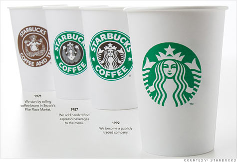
from http://money.cnn.com/2011/01/05/news/companies/starbucks_new_logo/index.htm
You can see how the logo has progressed from 1971 to today, starting out bland and detailed but informative in 1971, to bright and detailed in 1987, to a little less detailed in 1992 and now, completely missing the company name and using a simplified version of the old logo.
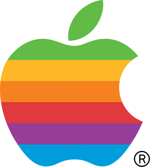
Now, in my opinion, the new logo is simple and elegant but removing the company name is confusing to me. Why would you create a logo without the company name? ...Especially since the logo Starbucks uses consists of a mermaid, which has absolutely nothing to do with coffee. Although there are other companies which have logos without the company name, but the logos make more sense. For instance Apple's logo which has progressed from:
 to
to  over the years.
Apple's logo makes complete and ironically literal sense, an apple represents the company brand name rather than representing that the company makes computers and other electronics.
Going back to Starbucks, I'm not the only one who is confused by the change in logos, the article sited above quotes Starbucks fans who are outraged by the change. So, why are some Starbucks fans angered by the change in logo while others think the change is "a beautiful and compelling way to move the company into the new millennium"? And why do some logos without the company name work for Apple, and not for others, perhaps like Starbucks? In Starbucks' case, is it because their new logo has nothing to do with coffee or for some other reason?
from http://money.cnn.com/2011/01/05/news/companies/starbucks_new_logo/index.htm
You can see how the logo has progressed from 1971 to today, starting out bland and detailed but informative in 1971, to bright and detailed in 1987, to a little less detailed in 1992 and now, completely missing the company name and using a simplified version of the old logo.
Now, in my opinion, the new logo is simple and elegant but removing the company name is confusing to me. Why would you create a logo without the company name? ...Especially since the logo Starbucks uses consists of a mermaid, which has absolutely nothing to do with coffee. Although there are other companies which have logos without the company name, but the logos make more sense. For instance Apple's logo which has progressed from:
Apple's logo makes complete and ironically literal sense, an apple represents the company brand name rather than representing that the company makes computers and other electronics.
Going back to Starbucks, I'm not the only one who is confused by the change in logos, the article sited above quotes Starbucks fans who are outraged by the change. So, why are some Starbucks fans angered by the change in logo while others think the change is "a beautiful and compelling way to move the company into the new millennium"? And why do some logos without the company name work for Apple, and not for others, perhaps like Starbucks? In Starbucks' case, is it because their new logo has nothing to do with coffee or for some other reason?
Subscribe to:
Comments (Atom)